Lesson 2: What do the probabilistic seasonal forecast maps represent?
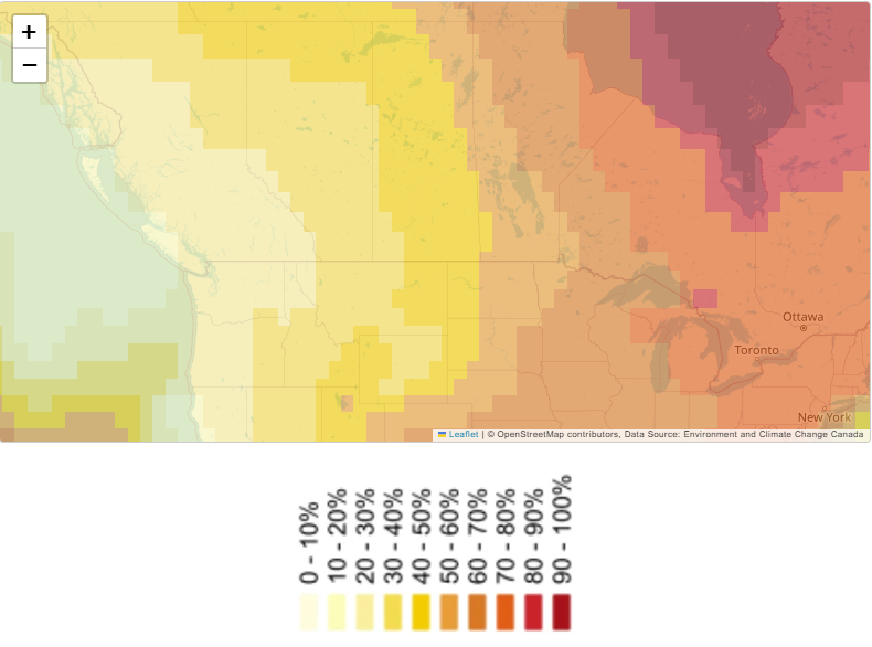
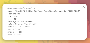
The seasonal forecast maps display the probability of occurrence three categories for the seasonal mean: above normal, near normal, or below normal. In addition to the general legend color guide, numerical probabilities (%) for occurrence are provided, and can be viewed when clicking any location on the maps. The percent probability is shown in the value_0 attribute, as illustrated below where this example tells us there is a 56.29% likelihood of above average temperatures at this location:
1. Introduction
Seasonal forecasts estimate general temperature and precipitation trends for the coming months. Unlike short-term weather forecasts that focus on exact temperatures or specific weather events, seasonal forecasts look at whether conditions will tend to be above, near, or below their long-term averages. These maps are “probabilistic,” meaning they display likelihoods—percentages that convey how strongly the forecast leans toward one category over another.
Why Probabilistic Forecasts?
- Uncertainty over Longer Timescales: The atmosphere and ocean are complex systems, so confidence in exact predictions declines with time.
- Risk Management: Rather than a simple “warmer or not,” probabilities help farmers, resource managers, and decision-makers judge the risk of different outcomes.
2. How the Forecast Is Produced
2.1 Ensemble Modeling
ECCC uses an ensemble of 20 forecasts—two forecast models, each run 10 times with slight variations in initial conditions. Each “run” yields a possible scenario. Combining them reveals how frequently above normal, near normal, or below normal outcomes occur. The proportion of runs that fall into each category translates directly into the forecast probabilities.
For example, if 11 out of 20 runs predict higher-than-average temperatures, then the probability for “above normal” is 55%.
2.2 Reference Period (1991–2020)
All forecasts reference a 30-year “climate normal” period to define what is considered above, near, or below normal:
- Above Normal: Seasonal means higher than the upper range of the historical middle-third.
- Near Normal: Seasonal means within the central band of the 30-year distribution.
- Below Normal: Seasonal means lower than the lower range of that central band.
By using this rolling 30-year window (currently 1991–2020), the forecasts stay tied to relatively recent climate conditions.
3. Categories and Their Meaning
3.1 Above Normal
This category encompasses any seasonal average that exceeds the upper “normal” threshold. It could be just slightly above the long-term average or substantially above. Because the category is open-ended on one side, it can capture a wide range of outcomes.
3.2 Near Normal
“Near normal” is a narrower band. It is constrained by both an upper and a lower boundary around the historical median or average. As a result, it typically has lower probabilities in forecasts, because there’s a smaller range of values that fall squarely into this zone.
3.3 Below Normal
Like “above normal,” this category is open-ended—only bounded on its upper side by the near normal threshold. Anything from a marginally cooler (or drier) season to a much colder (or wetter, if the forecast is for precipitation) season all falls into this bin.
4. Reading the Seasonal Forecast Maps
4.1 Color Shading
The ECCC forecast map uses color ramps to show the likelihood of a given category (often “above normal”):
- Lighter Shades (e.g., pale yellow): Lower probabilities (e.g., 10–30%).
- Deeper/Higher-Contrast Colors (e.g., dark red or purple): Higher probabilities (70–100%).
Each color segment on the legend corresponds to a specific probability range. For instance, you might see a progression from white/yellow for 0–10%, 10–20%, up to reds for 70–80%, 80–90%, etc.
4.2 Numerical Probabilities
By clicking on a point on the map in the ECCC viewer, you can see the exact percentage for each category. For example, the value_0 attribute might read 56.29%, indicating a 56.29% chance of above normal temperatures for that location.
Tip: Always check these numerical values whenever possible. They provide a more precise picture of the forecast—especially when colors are visually similar or if you need high confidence for planning.
5. Interpreting the Probabilities
5.1 Baseline of 33.3%
Because there are three categories (above, near, below), a forecast with no particular climate signal would theoretically split probabilities into thirds (~33.3% each).
- If the probability for above normal exceeds 33%, it suggests a tilt toward warmer (or wetter) conditions.
- If it’s below 33%, the odds tilt away from that category.
5.2 Examples
- Forecast A
- Above Normal: 45%Near Normal: 30%Below Normal: 25%
- Forecast B
- Above Normal: 60%
- Near Normal: 25%
- Below Normal: 15%
5.3 The “Near Normal” Caveat
Because the near normal category occupies a smaller band (it is constrained on both sides), many ensemble runs will shift into above or below normal more readily. Therefore, you often see relatively lower probabilities for near normal. This asymmetry in category size can be important:
- Above/Below Normal: Open on one side.
- Near Normal: Narrow range, bounded by both upper and lower limits.
When a forecast suggests 40% for above normal, 20% for near normal, and 40% for below normal, you might notice near normal is lower in part due to its narrower definition.
6. Understanding Confidence Levels
A probability of 40–45% for a category is a “tilt,” but it also means there’s a 55–60% chance of something else occurring. High confidence typically comes with probabilities exceeding 50–60% for one category. Always weigh how large the “leading” category’s probability is against the sum of the other two categories.
7. Best Practices for Using the Forecasts
- Don’t Rely on a Single Value: Always look at the entire probability distribution. If the color shading suggests “above normal” but the probability is close to 35–40%, remember that uncertainty is high.
- Monitor Updates: Forecasts are updated monthly or seasonally as new data come in. Keep track of how probabilities shift over time.
- Consider Local Factors: Large-scale forecast signals may not capture local nuances (e.g., microclimates, proximity to lakes, unique land features). Use local expertise alongside the forecast.
- Think in Ranges, Not Absolutes: Even if “above normal” has the highest probability, it is not a guarantee. Risk management often involves planning around potential extremes.
8. Summary and Key Takeaways
- Probabilistic forecasts offer more nuanced insight than a simple “warmer/colder” statement; they provide likelihoods for each category.
- The ensemble approach (20 runs) underpins the probability estimates, accounting for different starting assumptions.
- Color-coded maps give a quick view, but numerical probabilities reveal precise confidence levels.
- A value above 33.3% indicates a tilt toward that category, while a lower value indicates it is less likely than climatology alone would suggest.
- Near normal is narrower and often less probable because it is constrained on both sides.
- Even the “most likely” outcome can still be less than 50%, reflecting the inherent uncertainty of long-range forecasts.
Use these maps to guide strategic decisions—especially in agriculture, water resource management, and other climate-sensitive areas—while remembering that no seasonal forecast can perfectly predict the future. Interpreting probabilities wisely can help you hedge against climate risks and respond more effectively to potential weather extremes.